Lines
To help visualise, e.g., time-series data obtained through 3GPP,
we provide a number of support functions. If, for example, one has executed the
mlist.get_localpartscount() command with per_year=True, one can use
lines.evolution_of_participation_1D() to visualise how the number of get_localparts
changed over time for each domain, which is related to the number of participants
belonging to each organisation:
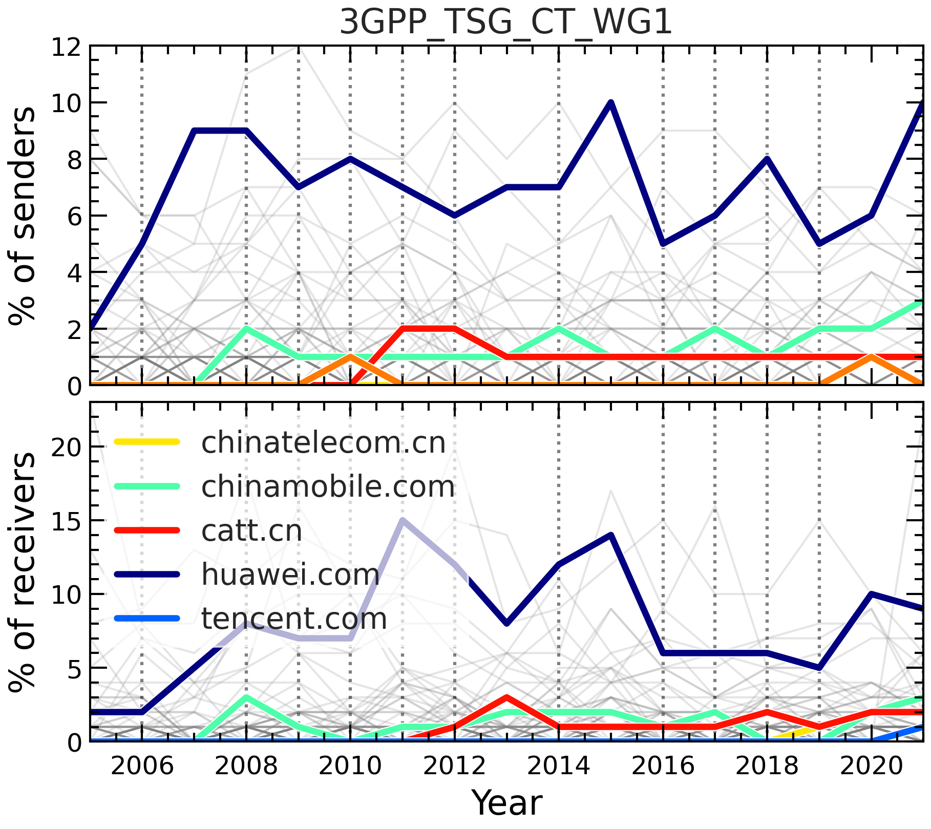
from bigbang.analysis.listserv import ListservMailList
from bigbang.visualisation import graphs

mlist_name = "3GPP_TSG_SA_WG3_LI"
filepath = f"/home/christovis/InternetGov/bigbang-archives/3GPP/{mlist_name}.mbox"
mlist = ListservMailList.from_mbox(
    name=mlist_name,
    filepath=filepath,
)

dic = mlist.get_localpartscount(
    header_fields=['from'],
    per_domain=True,
    per_year=True,
)

entities_in_focus = [
    'catt.cn',
    'chinaunicom.cn',
    'huawei.com',
    'chinatelecom.cn',
    'chinamobile.com',
]

fig, axis = plt.subplots()
lines.evolution_of_participation_1D(
    dic['from'],
    ax=axis,
    entity_in_focus=entities_in_focus,
    percentage=False,
)
axis.set_xlabel('Year')
axis.set_ylabel('Nr of senders')
The above code produces the following figure:
Alternatively it can also be visualised as a heat map using
lines.evolution_of_participation_2D(). Similarly, one can plot the evolution
of, e.g., different types of centrality of domain names in the communication network:
from bigbang.analysis.listserv import ListservMailList
from bigbang.visualisation import graphs

dic = mlist.get_graph_prop_per_domain_per_year(func=nx.degree_centrality)

fig, axis = plt.subplots()
lines.evolution_of_graph_property_by_domain(
    dic,
    "year",
    "degree_centrality",
    entity_in_focus=entities_in_focus,
    ax=axis,
)
axis.set_xlabel('Year')
axis.set_ylabel(r'$C_{\rm D}$')